Kulcha App
Snack, socialise and stop Googling
A guide to effortless restaurant exploration
This work predates my current AI-augmented practice. It’s from 2023, pre-Claude era. I’ve kept the project here as a record of how I worked then.
At a glance
- The problem
- Finding somewhere new to eat had turned into a research task, spread across reviews, socials and word of mouth, with no single place to keep any of it.
- What I did
- Designed on a three-person team through a three-week client sprint: more than fifty behavioural interviews across ages 16 to 45, a survey and a competitor analysis, then paper and mid-fidelity prototypes tested and reworked over two rounds.
- What it produced
- A tested prototype where all five participants completed the core task of finding a restaurant, plus a recommendation flow and a save interaction they used without confusion.
The Problem
Kulcha was already live and already had an audience, which made this harder rather than easier: there was no blank page to design onto, and no licence to break what people were already doing. What the app had not solved was the thing those people actually cared about, which was finding a recommendation they could trust without doing an hour of homework first. That research was scattered across reviews, social posts and group chats, and nothing held it in one place long enough to be useful.
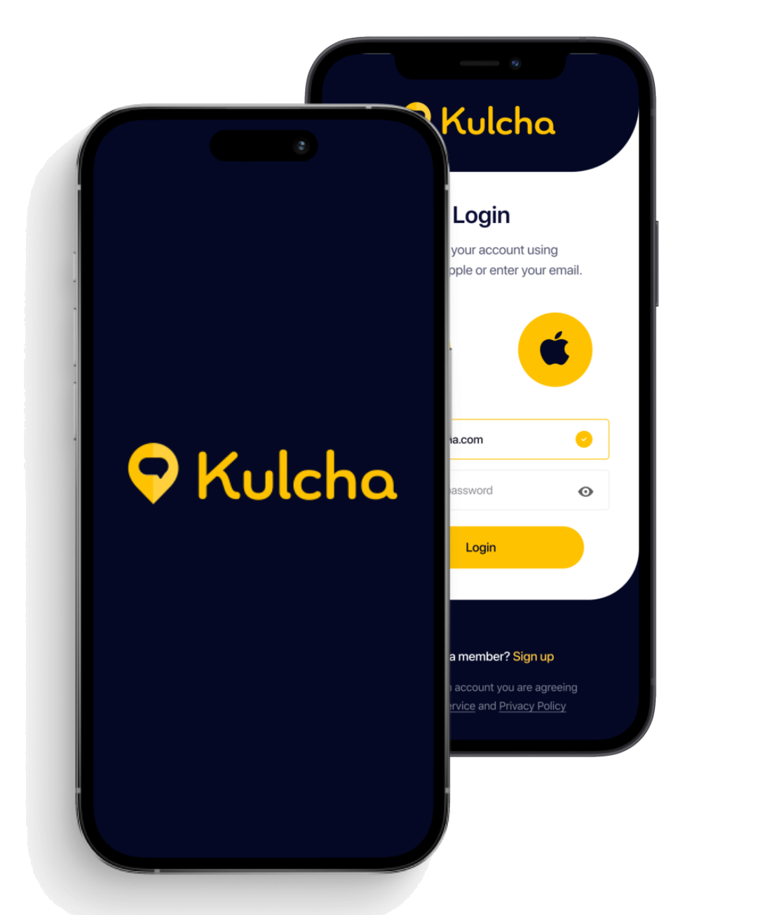
Who’s the client?
Kulcha is a social app for finding places to go: restaurants, cafes, bars, hotels and activities, anywhere in the world.
You follow people, you build lists of recommendations, and you share those lists with whoever follows you.
The main challenge
The challenge we were handed was finding recommendations people could trust.
The discovery workshop with the client broke that into three:
- Navigation issues
- Selling the social aspect of Kulcha
- Simplifying the onboarding and app’s ease of use
Research goal
To understand how people behave, and what they are actually after, when they are searching for or recommending somewhere to go.
The Approach
Three weeks, three of us, and five things to get through:
- Market research
- Competitor research
- Ten interviews with existing users
- More than fifty behavioural interviews
- Sixty-one survey responses
Market research
The market is crowded, so the first thing to settle was where Kulcha actually sits, which is between travel and leisure apps on one side and social networking on the other.
Working through both, I found that the travel and leisure app market holds 1.5 billion users worldwide and is forecast to grow 10.6% from 2019 to 2026, while the social media app market holds 4 billion users and is forecast to grow 26.2% from 2023 to 2030.
Both are growing, and neither one owns the overlap. That gap is the room Kulcha had to move into.
Market forecast
10.6%
Travel and leisure app market
growth from 2019 to 2026
26.2%
Social networking app
growth from 2023 to 2030
Competitor analysis
Apps like Out of Office, and Tabelog in Japan, already cover all five of the things people expect: uploading photos, adding friends, viewing details, adding recommendations and saving to a wishlist. Kulcha covered three of the five.
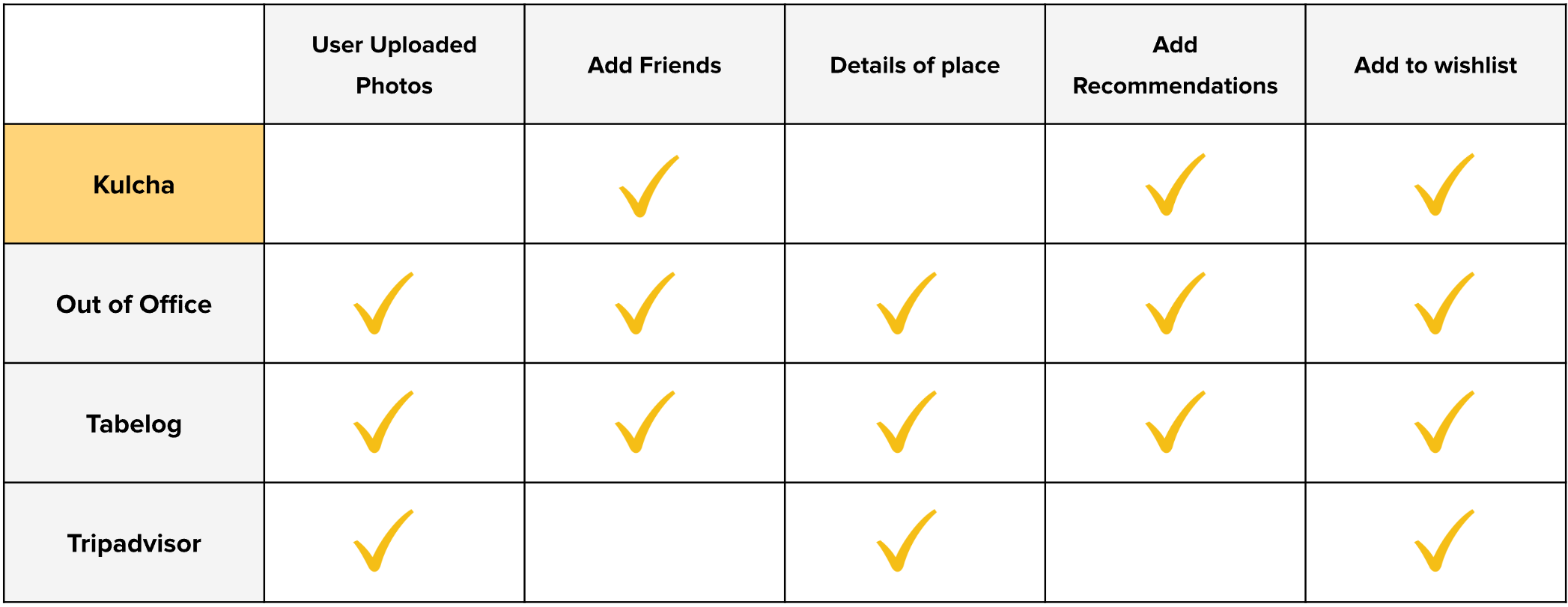
That set the baseline: not a wish list, but the table stakes for anything in this category.
User research
The interviews started with ten people already using Kulcha.
What came back most often:
- Looking for places to eat above anything else
- Using Kulcha purely for recommending places they’ve been
- Relying on word of mouth and Google searches to discover new places
- Keeping track of recommendations using the Notes or Maps app on their phones
- Researching using other platforms before deciding which place to visit
Kulcha’s existing users
What they’re doing
- Only using Kulcha for recommending
- Relying on word of mouth and Google searches to discover new places
- Keeping track of recommendations using Notes or Maps app on their phones
- When searching for places to go, searches on other platforms before deciding.
- Usually looking for places to eat above anything else
What they’re saying
- “New users wouldn’t find value in a recommendations app on a page with no recommendations”
- “Kulcha funnels you to do certain things, but it takes too long to get you there”
- “Too many buttons to push”
- “I love Kulcha, but I don’t use it that frequently, I only add data after visiting a place”
- “Multiple buttons to do the same thing”
Behavioural interviews
We then interviewed more than fifty people from a range of countries and backgrounds, aged 16 to 45, who had never opened Kulcha.
People who already use an app tell you about the app. People who have never seen it tell you about the problem, and the problem was what we were there for.
Key insights
Most people recommend restaurants to others
People bookmark or create lists on Google Maps/Notes App
People use Instagram/TikTok when searching for places & verifying the vibe, atmosphere, comments, photos, popularity, etc.
People cross check against multiple sources when researching and tend to do a lot of research to verify/manage their expectations
Survey data
A survey ran alongside the interviews, to put numbers against what people had been telling us one at a time.
These results come from sixty-one respondents:
Key insights
How do you typically organise and save recommendations that you receive from friends/family or online platforms?
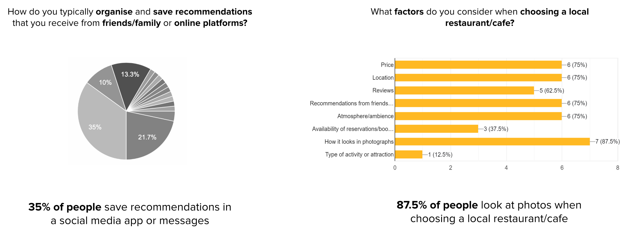
What factors do you consider when choosing a local restaurant/cafe?
35% of people save recommendations inside a social app or their messages
87.5% of people look at photos when they are choosing a local restaurant or cafe
Food for thought: an audit of Kulcha as it stood
Before designing anything we ran a contextual inquiry and sat with five people while they used Kulcha as it was. Watching someone struggle with a screen you are about to redesign is the fastest way to stop arguing about it.
What that turned up:
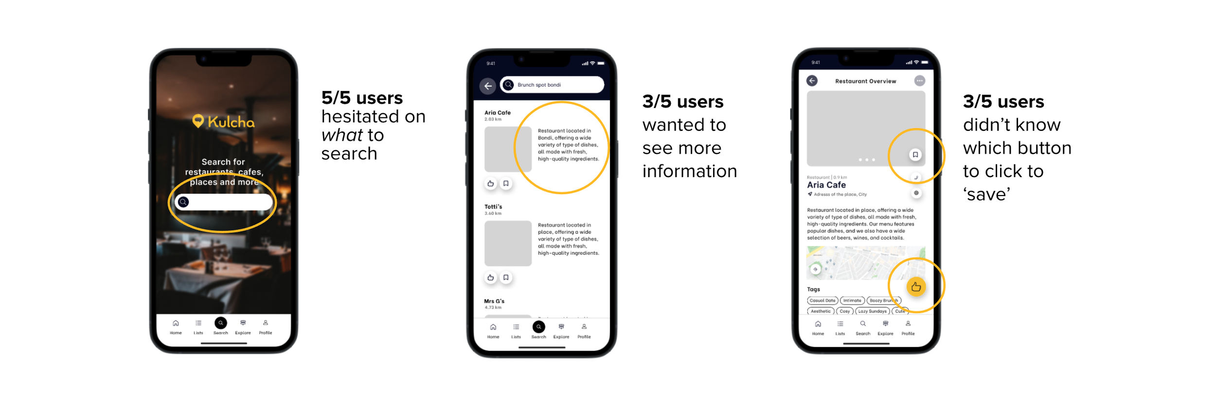
- It took some people 10 minutes to find recommendations at all, on an app whose whole purpose is recommendations
- Four of five could not tell the save button from the recommend button
- Three of five could not work out how to search
- People told us the Restaurant Overview screen felt unfinished, and that they wanted more on it before they would act on anything it said
One thing came back the same way through every method, and it was not on the client’s list: people were looking for places to eat above anything else.
Key insights
Choice paralysis:
Too many ways to do the same thing and too many options
Icon ambiguity/confusion:
Too many icons meaning the same thing/confusing text
Lack of structure:
Information and hierarchy that needed structuring
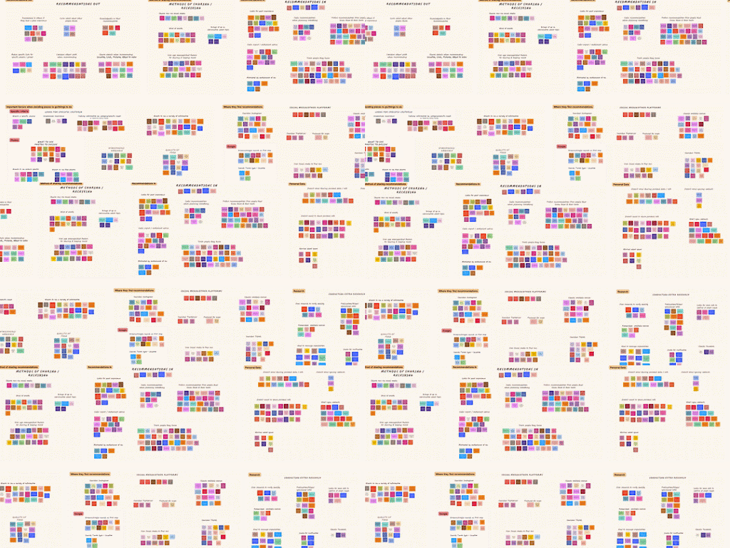
Overwhelmed with all the insights…
All of that left a wall of notes and no order in them, so the three of us grouped and regrouped until the priorities were something we could argue about.
Which led us to…
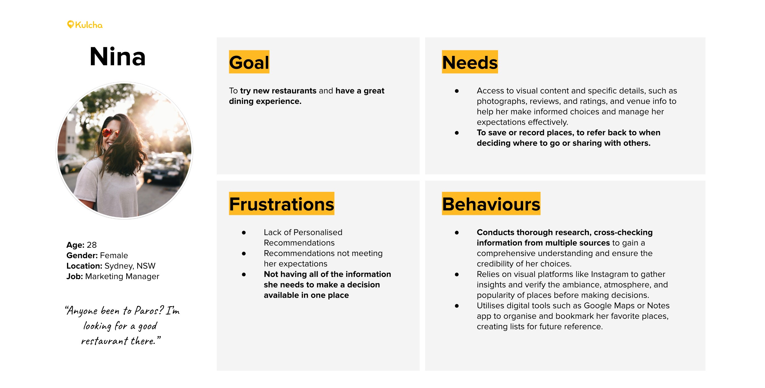
We built ‘Nina’ as Kulcha’s core user, out of the traits that came up most often across the interviews.
She is there so that a disagreement about the design has a specific person to be about. “The user” can be argued into wanting anything. Nina cannot.
Understanding Nina
We mapped what she does and how she feels at each step, against what the app could realistically do about either.
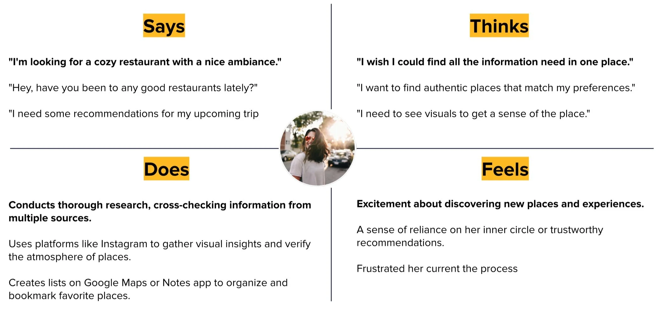
We then concluded…
The delicious truth: what the research narrowed it to
Nina needs to consolidate her restaurant research so that she can make an informed decision about which restaurant to visit.
The user journey
This is the path Nina takes now, every time she wants somewhere to eat:
Asking friends for recommendations
Asks friends for recommendations through word of mouth, messages or chat.
Takes notes or copies data from chats and social media replies to save it.
Feeling: Excited
Searching for restaurants
Searches name of place and address to find websites/or articles.
Checks Google Maps for the distance and reads the reviews, without being sure she can trust them.
Feeling: Overwhelmed & Unsure
Cross-checking sources
Looks at social media accounts or hashtags of the venue to look at images of food and interior.
Reads in-depth listicles/blogs.
Feeling: Doubtful & Apprehensive
Deciding and saving the restaurant
Discards any options that don’t meet her expectations or look low quality.
Saves/pins the good venues and data to a list.
Takes screenshots of the place.
Feeling: Relieved & Excited
Visiting the restaurant
Refers back to notes to access map info.
Uses map directions to get there.
Goes to venue and has a meal.
Takes photos and shares.
Feeling: Apprehensive, Relieved & Content
Five steps, and not one of them is the meal. Nina goes from source to source to find the information, and then again to convince herself the place is worth the evening.
That is the gap we went after.
Idea generation
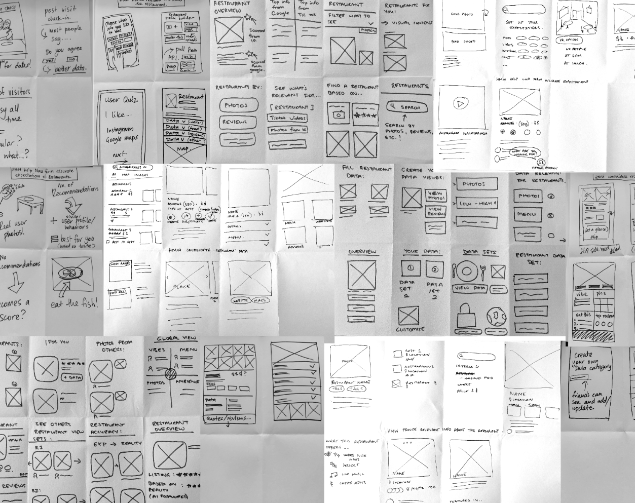
We brainstormed against four prompts, written from what the journey had exposed:
How might we…
- Provide relevant information about the restaurant?
- Consolidate restaurant data?
- Help Nina form accurate expectations of restaurants?
- Make it fun to organise restaurant information?
The winning dish: what we chose to solve
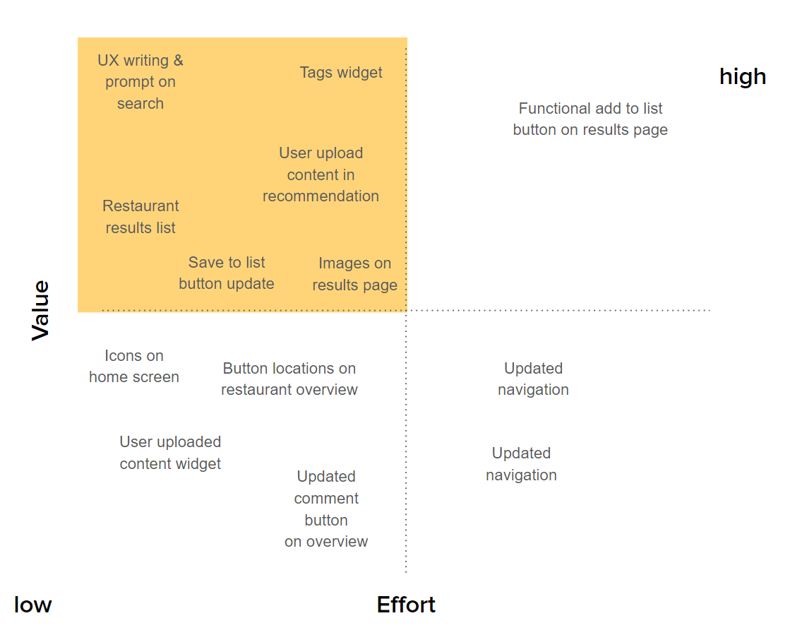
The feature prioritisation map left four contenders, and three weeks left room to be right about one of them:
- A simpler search screen, with the writing and prompts reworked
- Different information shown in the restaurant list
- A new icon language for the buttons and interactions
- And the one it turned on: an expanded Restaurant Overview screen
Prototypes, usability testing and user feedback
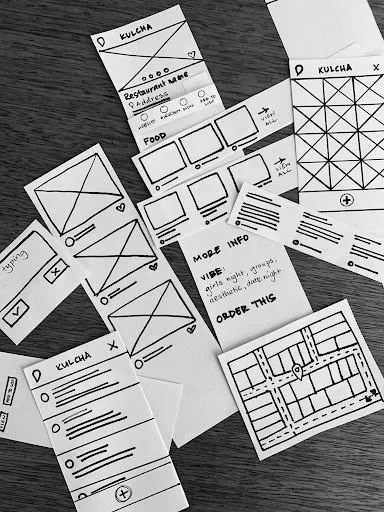
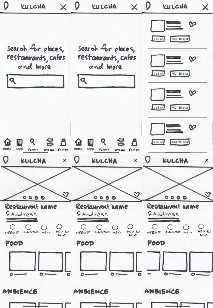
We mocked up a paper prototype and a task flow around one idea: a collated Restaurant Overview screen.
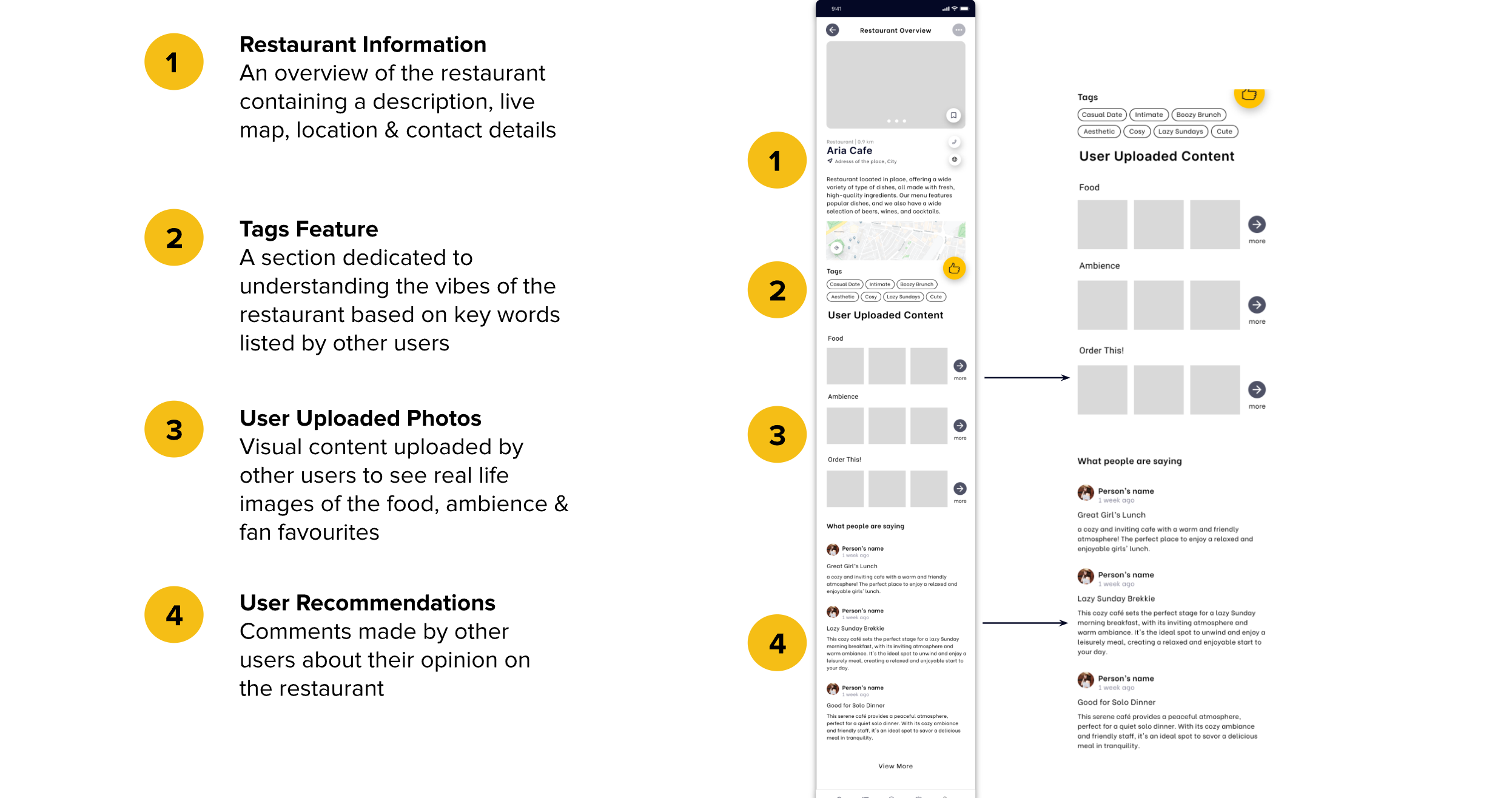
Its order is the research, made literal. What people said they needed first sits at the top, and what they said they needed least is what you scroll to.
Usability testing: the first paper prototype
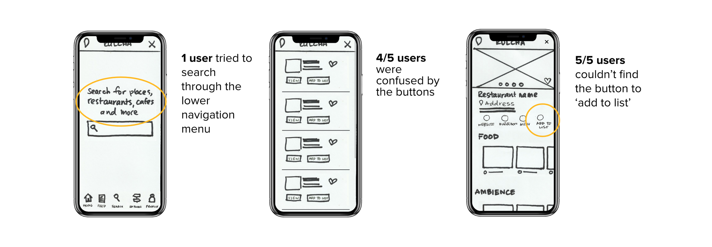
We tested the paper prototype with five people. It exposed these flaws.
Usability testing: the mid-fidelity prototype
We changed what the first round had exposed, built it up to mid fidelity and tested again. This is what the second round found.
Updating the buttons and icons
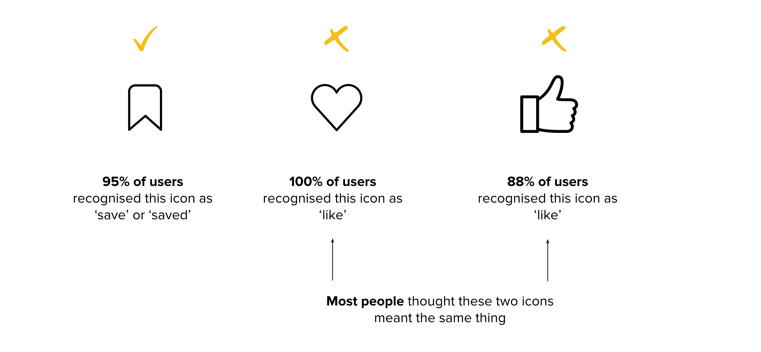
That left the buttons, which were what four of five people had been getting wrong.
I ran a short survey on the icons alone, asking people what they thought each one meant, with no screen around it to give the game away.
Convention already had an answer for the ‘recommend’ button, and I had read it. What a convention cannot tell you is why the people in front of you keep reading it as something else, so I tested it here rather than taking it on trust.
Existing
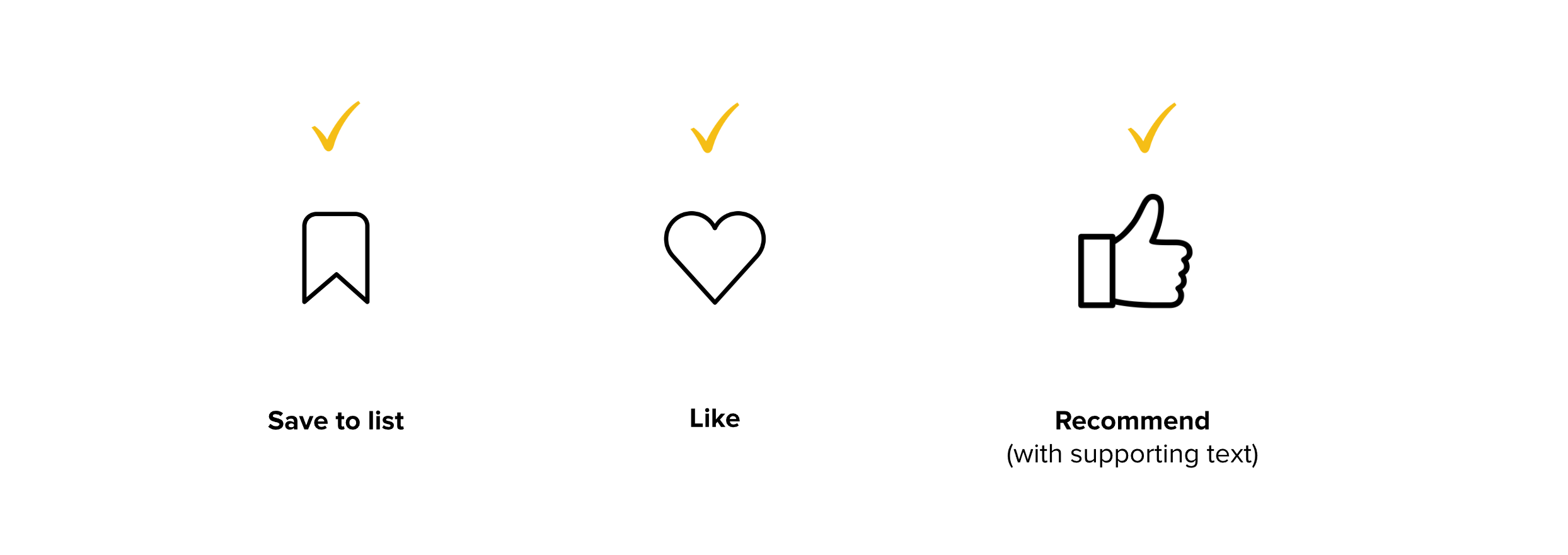
The new icon language
Creating micro-interactions
Testing also turned up something quieter: three of five finished a task without being sure they had finished it.
The micro-interactions answer that directly. Every action now says back, immediately, that it landed.
.gif)
.gif)

How to order: the hierarchy of content
The final Restaurant Overview screen comes down to four bands of content, in the order people like Nina told us they wanted them.
The Outcome
Prototype walkthrough
The final prototype, start to finish:
Outcome
- Every participant completed the task of finding a restaurant
- People said the Restaurant Overview screen gave them enough to decide whether the place was worth going to
- The recommendation task was completed without confusion, which is where the icon work paid
- Saving a restaurant to a list worked, and it was the feedback on the button that told people it had
Measuring success
The MVP is the Restaurant Overview screen, and specifically the fact that everything is on it.
It carries the details the research said people actually needed, in one place, so the decision can be made on that screen instead of across the five stops the journey map laid out. That is the whole claim, and it is the thing worth measuring.
The metrics I would watch:
- User attrition
- Number of recommendations
- Number of ‘saves’ to list
Value for Kulcha
- People stop needing the other apps to fill the gaps, which is the reason to open Kulcha first rather than last
- A recommendation worth passing on is how the app grows without paying for it
- The content people want to see is the content other people want to share, so the two feed each other
- Recommending gets quick enough to be worth doing, and every recommendation is content Kulcha did not have to make
Next steps
- Take the icon changes through the Activity Feed and Home screens
- Let people upload their own photos and reviews inside the recommendation flow
- Add table booking through The Fork and Open Table rather than building it
- Either simplify the Explore screen or fold it into Search as filtering, because two screens are doing one job
- Rework the List screen
Reflection
Three weeks and three of us meant we could research broadly or design deeply, and not both. The client arrived with three problems, and what the research kept returning to was none of them exactly: it was the Restaurant Overview screen, which people told us felt unfinished and which they wanted more from before they would act on anything it said. Choosing to spend what was left of the sprint there, rather than spreading it thinly across the brief we had been handed, is the decision the project turned on, and deciding what not to build was harder than deciding what to build.
The icon work is the part I would do the same way again. Convention had an answer for what ‘recommend’ should look like, and I ran a survey on it anyway, because we had already watched four of five people read save as recommend and no amount of best practice was going to tell us why they did.
What I would change is the order. We ran the process end to end, more or less A to Z, when the audit of the live app had already shown us where the pain was. Going deeper on the thing that was plainly broken, sooner, would have bought us another round of testing on it.