Case study · Fintech · Greenfield enterprise portal · Australian financial advisory firm · 2024
Service Portal Onboarding
Only 17% of this firm’s clients said they would prefer to manage their services online. Read flat, that number kills a client portal before it starts, and it landed on a programme the business had already committed to: a greenfield portal for a firm where accounting, tax, wealth and advisory work sit under one roof for more than 250,000 clients, built to get confidential financial information off unsecured email and to bring down the cost of serving each of them. I owned the research synthesis for that programme and designed the onboarding flow, which made the 17% mine to interpret. I read it as the shape of a tech-conservative audience rather than a verdict on the idea, because 17% of a quarter of a million people is still 42,000 of them, and 42,000 clients is not a rounding error, it is a launch. So I designed for the least confident client in that group rather than the most capable one, and that call shaped everything we put in front of executives and the board.
All interfaces below are recreations built for this case study. Branding & details changed; no client IP shown.
At a glance
- The problem
- Confidential financial information was moving over unsecured email, and only 17% of clients said they would prefer to manage their services online.
- What I did
- Owned the research synthesis for the whole programme and designed the onboarding flow, reading the 17% as the shape of a tech-conservative population rather than a verdict on the idea.
- What it produced
- A UX strategy, design recommendations and four prototype explorations, taken to executives and the board for a build-new-versus-extend decision. It did not ship, so there is no adoption metric.
Confirm these details
We’ve pre-filled some details for you. Please check that they’re correct.
First name
Last name
We just sent you a code via SMS
Enter the 6-digit security code we sent to +61 ••• 452.
myPrtal
You’re all set up!
Your account has been created. There is a lot you can do to make the most of the portal:
- Manage files & documents in one place
- Instant notifications to keep on top of tasks
- Schedule one-off or ongoing meetings
Three moments from the onboarding flow I designed. Recreations; no client IP.
The Problem
There is a moment in our journey maps I kept coming back to. A client receives an invoice by email, and before they can pay it they have to work out whether it is real. They check the sender address. They squint at it. The question written on that journey map is “is this a scam?”
That question is the whole problem. The firm does accounting, tax, wealth, audit and advisory work for everyone from individual taxpayers through to enterprise clients, and a great deal of that work was arriving in people’s inboxes. Invoices, agreements, requests for documents. Meanwhile the fraud around it had become very good, and I did not need our own client research to prove that: I cited two widely reported cases to the team, both public, neither one of ours. A finance worker paid out $25 million after a video call with a deepfake chief financial officer. A father heard his son’s cloned voice on the phone. When we mapped what clients told us trust actually meant, one of the things they said was that they needed to be able to verify their relationship with us by checking an email address. That is a fragile thing to hang trust on.
The business goal itself was clear enough: give staff and clients one secure place to meet, take the risk out of sending data and files over unsecured email, and eventually turn attachments off altogether. The goal was never the hard part.
The harder thing to say out loud was that none of this was an interface problem. Relationships with those 250,000 clients ran through people, through scheduled meetings and phone calls and email and the occasional text message, so every exchange was bespoke, high-touch and personally attended, and even the most routine request landed on someone’s desk as a back-office task. Service delivery had been welded to personal relationship management, which works beautifully at ten clients and collapses at a quarter of a million. You cannot standardise that with a better screen. You standardise it by rebuilding the service around the jobs clients are trying to get done, rather than around the way the organisation happens to be arranged inside.
The commercial logic ran deeper than compliance, too. In this industry the scarcest resource is fee-earner time. The most rigorous benchmark going, from Kitces Research across nearly 1,000 advisers, puts the average cost of acquiring an advisory client at US$3,119, and 83% of that is the adviser’s own time rather than marketing spend. Every client interaction that arrives as an unstructured email is a slice of that same expensive time, spent unbilled. A portal that turns interactions into structured services attacks cost-to-serve as well as risk.
And here was the tension, sitting between two facts that did not want to agree. The business needed clients online, and it needed that soon, because every month on email was another month of exposure. And there was that 17% again, sitting on the other side of the ledger this time: not a segment to court but very nearly the whole population the business was asking to change its habits for. There is a slide in my deck that says nothing except Business Goal ≠ User Goals, because I kept needing to say it out loud. Designing only against the compliance mandate would have built something clients had already told us they did not want, and adoption would have proved the point for us. Designing only against what clients said they wanted would have missed the risk entirely. The work was finding the version where both could be true.
The Approach
My role & ownership
I owned two things end to end on the client portal programme: the research synthesis for the whole project, and the onboarding flow. The synthesis drew on a staff survey, client NPS, a journey analysis, a teardown of four fintech competitors and an audit of the portal the firm already had. Listing those is the least interesting part. What they bought was the strategy the rest of the team designed from, and the reading of the 17% that redirected the whole engagement.
The companion piece I also owned, a 7-question Service Wizard that turns life context into service recommendations, has its own case study.
How the engagement was shaped
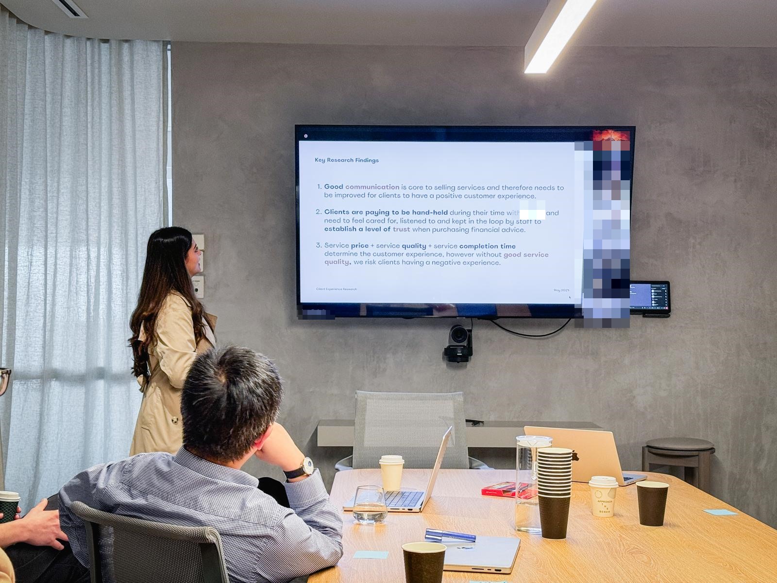
We were not another pair of hands inside the business. The design team consulted to the firm’s internal digital CX squad and led them through the work, which meant every method had to stay legible to people who did not think of themselves as designers. The sequence was conventional enough, benchmarking and surveys and interviews, then personas and end-to-end service mapping, then architecture, flows and prototypes, and finally a North Star deck with a one-year product vision behind it. What made it difficult was never the sequence. It was that a room of non-designers had to be able to follow the reasoning at every step, and agree with it, before any of it could become a decision the firm would actually fund.
Three sub-features carried that vision, designed to work as a sequence rather than a set. Onboarding was designed to replace branch-mediated sign-up and verification, the Service Wizard was designed to let clients begin and finish routine requests on their own so the most common tasks would stop arriving as back-office work, and a payments flow was designed to bring invoicing into the portal itself. That last one closes the loop on the story this case study opens with.
What 17% actually meant
Everything turned on that 17%. It is an easy number to read as a verdict. Only 17% want this, so why are we building it?
I did not think that was what it said, so I put it against the diffusion of innovation curve. In a normal population, innovators and early adopters together are roughly 16% of people, which means a 17% appetite is about what you would expect for a product that does not exist yet. But this client base is not a normal population. It skews tech conservative, so the curve is negatively skewed. Its genuine innovators and early adopters are closer to 6%, and the group directly behind them is around 9%.
The 17% was never a ceiling on interest. It was the shape of the people we were designing for.
That changed the brief. It meant building for early adopters was a dead end, because there were barely any. Whatever we made had to work for someone who is not confident, is not curious about new software, and is not going to persevere when it gets hard. Build for them and the majority can follow. Build for the 6% and nobody does. Every decision after this one leans on it.
What clients told us they actually wanted
Alongside the numbers, the research kept returning three needs, and none of them were about software. So I reframed what we were measuring. Customer experience here comes down to three things: the level of trust, the quality of support, and the quality of the deliverable. Mapping the needs onto those three told me which ones were actually mine to fix, and that became the test I held every decision against rather than simply moving people off a channel.
“I need to trust you.”
Level of trust
These are the same clients who told us they verify a relationship by checking an email address. Design can replace that with something sturdier.
Design can move this“I need more convenience.”
Quality of support
Less chasing, less repeating yourself, less waiting to find out where something is up to. All of it is interface work.
Design can move this“I’d like to do everything on my phone.”
Quality of deliverable
A phone cannot improve the tax return itself. What this one does is set the platform, and it is why the flow is mobile first.
Only partly oursTwo of the three were mine to fix. Knowing which was which is what kept the work honest.
There was one more thing clients said, and it turned out to be the hardest to design for.
I need financial help, but I don’t know what financial service I need.
Recurring client quote, client research
The fork in the road
The firm already had a portal, built around timelines, threads, posts and replies, which is to say built like Slack or Teams, and adoption on it had stalled. So the real question underneath “design the onboarding” was whether that shape was right at all, because onboarding people into the wrong product only gets them to the disappointment faster. I worked through it as a set of questions and answered them honestly.
Does a thread and post interface fit what we are actually selling?
It depends entirely on who the client is and what service they have bought. For most of them, no.
Is there a clear path from open chat to productised services?
Collaboration software is built to host unstructured conversation. A productised service needs structure and a well defined flow.
Do we want to encourage unstructured conversation?
Moderating hundreds of thousands of unstructured chats would be enormously labour intensive, and it hands the work back to the client, to work out what to type, what to ask, and whether anyone read it. A tech-conservative population, the same population behind that 17%, is precisely the population that will not persevere with an unstructured chat interface.
Every answer pointed the same way, so I recommended we stop treating the portal as a conversation and start treating it as a set of structured services, where every interaction arrives already shaped as something to act on. That did not mean stripping the relationship out.
The service model I built it on
The model I landed on separates the account, the entity, the service and the individual step, then places each interaction somewhere on a line between relational and transactional. Keep the highly relational interactions where they make sense, because that is what people are paying for. Complement them with transactional ones that make things more convenient for the client without adding work for the firm.
Level 01
Account
Who can sign in, and in what capacity. Owner, admin, editor, viewer.
Level 02
Entity
The person, business or trust the work is actually for. One account can hold several.
Level 03
Service
A productised piece of work with a start, a scope and a price.
Level 04
Step
The single thing being asked of someone right now. This is what a notification points at.
Separating these four is what let onboarding finish at “you’re all set up” instead of dragging a service purchase into account creation. An account is not a service, and conflating them was the mistake I had to undo.
Keep human
Advice conversations, strategy reviews, anything where judgement is the product. This is what clients are paying for.
Assist
Progress on a service, what is waiting on whom, what happens next. Human work made legible without a phone call.
Absorb
Documents, invoices, scheduling, identity. Pure overhead for both sides, and the clearest case for self-service.
Placing every interaction on this line is how I decided what the portal should take over and what it should leave alone. The tradeoff I accepted: the portal deliberately does less than it could. Anything that would have automated a judgement call stayed with a human, which costs efficiency the business would have liked to bank.
Two scenarios, one shared core
The firm acquires portal users through two distinct paths, and treating them as one flow would compromise both. So I designed a shared account creation core (verify identity, set password, confirm device) and bracketed it with scenario-specific entry and exit states.
Scenario 1. Existing client activates
Everything starts with an invitation email, which, given that the whole problem began with clients squinting at emails wondering whether they were real, had to work harder than most. I led it with the purpose rather than the credential, so the first thing you read is what you are being invited to do, not a password you have to use before it expires. From there I moved authentication to phone verification and an optional device trust, which is passkey eligible. Passwords are easy to guess and easy to steal, and a passkey is both safer and faster for someone who does not want to think about it.
Your temporary credentials (action required)
Username: amorgan_4471
Temporary password: Xk9!vQ2r
Please log in and change your password. This password expires in 24 hours. Do not reply to this email.
Log in
If you did not request this, contact your administrator.
Your client portal is ready, Alex
Manage your services with us, online.
Your adviser has set up your secure portal account. See your documents, meetings and services in one place, without anything travelling over email.
Activate my account
This secure link is unique to you. No temporary password, nothing to expire.
Both are recreations. The pattern on the left is the one this project was trying to survive: a no-reply sender, a credential in plain text, and a countdown. For an audience already asking “is this a scam?” it is indistinguishable from phishing.
- 1A sender you can recognise. A no-reply service address is the single strongest phishing tell, and it was the thing clients were squinting at.
- 2Purpose before credential. The first line says what you are being invited to do. Nothing to copy, nothing to memorise.
- 3No expiry countdown. Urgency is a fraud pattern. A unique secure link removes the deadline, and with it the pressure to act without thinking.
Scenario 2. New client signs up
A new client arrives with no history to lean on, so I built the account creation core to carry them through cold: confirm the details we already hold, create a password, verify a phone with a six digit code, then choose whether to trust the device. I gave every step one primary action and nothing competing with it, put help on every screen without letting it shout, and kept progress visible the whole way, because for someone who is not confident with software, knowing how much is left is the single biggest thing you can do to lower the temperature.
Confirm these details
We’ve pre-filled some details for you. Please check that they’re correct.
First name
Last name
Email address
01 Confirm details
Create your password
To get started, please create a secure password.
Password
At least 9 characters, containing a letter and a number.
02 Create password
We just sent you a code via SMS
Enter the 6-digit security code we sent to +61 ••• 452.
Didn’t receive a code? Resend
03 Verify via SMS
Do you trust this device and browser?
Plan on coming back regularly? If you choose to trust this device, you won’t be asked for a security code next time you sign in.
04 Trust device, optional
myPrtal
You’re all set up!
Your account has been created. There is a lot you can do to make the most of the portal:
- Manage files & documents in one place
- Instant notifications to keep on top of tasks
- Schedule one-off or ongoing meetings
- Find all your information in one place
05 Safe landing
The four-step account creation core plus its landing state. Recreations.
Try the flow
The screens above are stills. Below is the flow running, so you can judge the thing I was actually designing for: what it feels like to be uncertain and still get through. Try a half-finished email address, a password that is too weak, or the wrong security code. The demo code is 472913, and the shortcuts underneath jump straight to the error and completion states.
Live prototype, keyboard operable throughout. Open full screen ↗
- 1Progress is stated twice. A bar for glanceability and “Step 2 of 4” in words, because for an anxious user a bar alone is ambiguous about how much is left.
- 2Errors name the fix, not the failure. “Needs 9 characters or more, including a letter and a number” rather than “invalid password”. The password meter never sits empty while the label calls it weak.
- 3The device choice is two plain statements. Not a checkbox with security jargon. Both options are framed as safe, because a tech-conservative user reading a security question will assume the unfamiliar answer is the dangerous one.
- 4The same help control, always in reach. It lives in the top bar the whole way through, which for this audience matters more than any single screen’s layout.
A decision I changed
My first onboarding draft bundled service selection inside account creation as a single flow. An internal review surfaced the issue I’d missed. It conflated having an account with having a service. Clients with existing services who got pulled into a wizard felt like they were being re-sold to, and the adviser community flagged the same risk from their side of the room.
So we split the flows. Account creation completes at “You’re all set up.” The Service Wizard becomes a discoverable, optional next step. Not a gate. That separation is what gave the design somewhere to stand when it went back to the adviser community. Wizards that pressure-sell were a non-starter for them, and rightly so.
myPrtal
Not sure which service fits?
Answer 7 quick questions about your goals and we’ll suggest services suited to you. Or browse the full catalogue any time.
Optional, never a gate
Detail decisions · Progress + reassurance
Progress bars on every screen. Help always visible. Trust-device offered as an optional passkey, not a forced setting. For a tech-conservative audience, knowing how much is left is the single biggest anxiety reducer.
Making the case without a villain
The honest version of this part is that nobody fought me on it.
The existing portal had been built a long time earlier, at a point when product design was not consulted, and largely by designers who had since left. So there was nobody in the room defending it. That sounds easier than it was. When there is no one to argue with, there is also no one who owns the decision, and it becomes very easy for a recommendation like mine to be heard as criticism of work the business had already paid for and was actively rolling out.
So I did not frame it as criticism. I framed it as a decision. The deck ends with the choices set out as questions for the sponsors rather than conclusions from me. Do we stop rolling out the existing portal, or roll it out knowing a replacement is coming? Do we build something new, or extend what we have? For each option I laid out what it would cost, what it would risk, and what it would mean for staff who would otherwise have to learn two portals at once.
I also put a disclaimer on the prototypes, in writing, saying they were not definitive visions of the product and that any real build would need the business and the engineering team in the room to work out what was viable and feasible. That was not hedging. It is the difference between a designer handing down an answer and a designer handing over a decision.
The Outcome
I produced a UX strategy, a set of design recommendations, and four prototype explorations covering account creation, the Service Wizard, the service interface, and billing and payments. We took it to executives and the board as the basis for a real decision about whether to build a new portal or extend the existing one.
I want to be straight about what this case study is and is not. There is no adoption chart at the end of it. This was a strategy and design engagement, and what it produced was direction and a decision point, not a shipped product with a metric attached. The value was in what it made possible to decide, and in the fact that I put evidence in front of the room instead of leaving it to momentum.
What I can quantify is the case the design makes, and I want to label it as exactly that: the business case, not a measured result. Turning off email attachments closes the fraud vector the whole engagement started from. Moving routine interactions into structured services hands unbilled admin time back to fee-earners, the firm’s costliest resource. And putting a browsable service catalogue in front of clients attacks a known, expensive gap: industry research finds 79% of professional-services buyers want more services from their current provider, while 48% do not know what their provider actually offers (Hinge Research Institute). The portal and its Service Wizard were designed to close exactly that gap.
What didn’t work
The vision we were designing towards had an asterisk on it. It said the specific target demographic and market segment still needed to be clearly defined by the business, and while I was on this project that never got resolved.
I kept going anyway. Designing for the least confident client was the right instinct and the diffusion curve gave me enough to work with, but tech conservative is a description of a population, not a decision about who we are for. The two segments we mapped wanted genuinely different things. Consumer clients wanted a personal relationship supported by self-service. Corporate clients wanted professional relationships supported by self-service and collaboration. Without the business committing to which came first, some decisions stayed softer than they should have been, and prioritisation questions I thought were settled kept reopening.
What I would do differently is refuse to carry that ambiguity quietly. Not by stalling the work, but by putting the question in front of sponsors as its own decision, exactly the way I did with build versus update, instead of absorbing it and designing around it. I was comfortable making the portal decision explicit. I should have been just as comfortable making that one explicit too.
Reflection
The thing I carry forward is what happened with the 17%. It is not automatically a verdict against the idea. It can be the shape of the people you are designing for instead, and once I saw that shape, tech-conservative, unwilling to persevere through friction, needing the confident 6% to go first, it told me exactly where to start.
Beyond that, this project taught me that the research is not the deliverable, and neither is the prototype. What I actually handed over was a room of executives and board members choosing between building new and extending what already existed, with the cost and the risk of each option set out in front of them, which is a decision the business could not have made honestly before the work was done. Everything I did here, the reframing, the questions, the prototypes, was in service of getting them to that table.